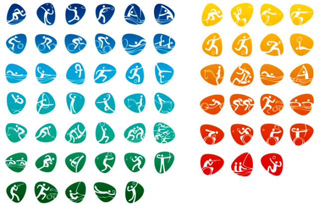
Rio 2016 recently unveiled its official pictograms, which for the first time ever will depict each of the 41 Olympic and 23 Paralympic sports that are part of the program.
The 16-month project began with designers researching each sport before creating the first strokes by hand.
These were then reconstructed on a computer, fitting the contours of the letters.
The athlete bodies and sports equipment were built from the characters, or part of them, in a continuous stroke, with variations in thickness in order to give the impression of depth.
The icons are pebble shaped, characteristic of Rio 2016’s visual language according to organizers, and they are designed to alter their shape to symbolize the athletes’ different movements.
The pictograms can be used both inside and outside the pebbles, in all colors.
“The pictograms, from now until the Games, will serve as a communication platform for the promotion of the sports, for partner activations and will be present in all the Games’ visual identity, including their application in venue decoration, signposting, tickets and licensed products, among other things,” said Rio 2016 brand director Beth Lula.
Pictograms were first used at London 1948 when their main purpose was to create a simplistic way of communicating and representing the various sports taking place to athletes, officials and spectators from all over the world with many different languages.
German designer Oli Aicher designed the pictograms for Munich 1972 and his clear and concise designs are generally considered to provide the basis for all of the pictograms used at Olympic and Paralympic Games since, as they depicted sport through movement and speed.
The typography used for the Rio 2016 icons was developed by Dalton Maag and is said to be inspired by the letters and numbers of the Rio 2016 logo and the essence of the Games – passion and transformation.
Designers claim the font is based on the contours of Rio and represent elements such as the Copacabana promenade, which is depicted in the letters “m” and “n” and the Pedra da Gávea mountain depicted in the letter “r”, while the letters are drawn with a single, continuous stroke, in an agile and fluid movement that mimics the movement of athletes it is claimed.
Once the Rio 2016 design team had finished creating the pictograms, the final stage of the process involved securing the validation to go ahead with the designs from the 42 International Federations.
For the 23 Paralympic pictograms, designers say that they sought to portray the integration of the athletes’ different impairments with sport in a balanced, natural way, depicting prostheses, blindfolds and other elements.
“For the first time, all Olympic and Paralympic sports are individually represented,” said Carlos Nuzman, President of Rio 2016. “This is one of our unique contributions to the history of the Games.”
Contact the writer of this story at gary.anderson@insidethegames.biz. Inside the Games is an online blog of the London Organizing Committee that staged the 2012 London Games. The blog continues to cover issues that are important to the Olympic Movement. This article is reprinted here with permission of the blog editors.